Web App With Material Design
Being firstly released by Google in 2014, Material Design has now already surpassed the realm of mobile apps and become a principle often utilized in web design. There is no wonder that touches of Material Design have been an irreversible trending of the year. But, what's it exactly? As Matías Duarte, the vice president of Google, explained:
"Unlike real paper,our digital material can expand and reform intelligently. Material has physical surfaces and edges. Seams and shadows provide meaning about what you can touch."
Basically, it's a way to make design elements look like touchable, and the properties of Goolge itself are the best examples of material design. As of right now, a growing number of websites have been dedicated to this topic, and we've made a collection of the best Material Design website examples for you to get inspirations.
12 Awesome Website Examples of Material Design
1. RumChata
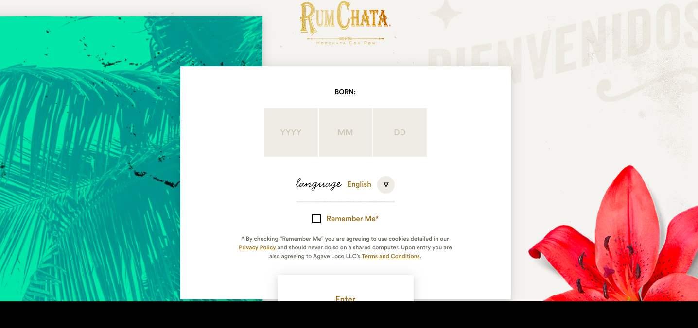
Combined with the physical aesthetics of Material Design, RumChata delivers a wonderful user experience by making the interface resemble those things in real world. Though it looks colorful, but seems to be intuitive at the very first glance.
2. DropBox Business
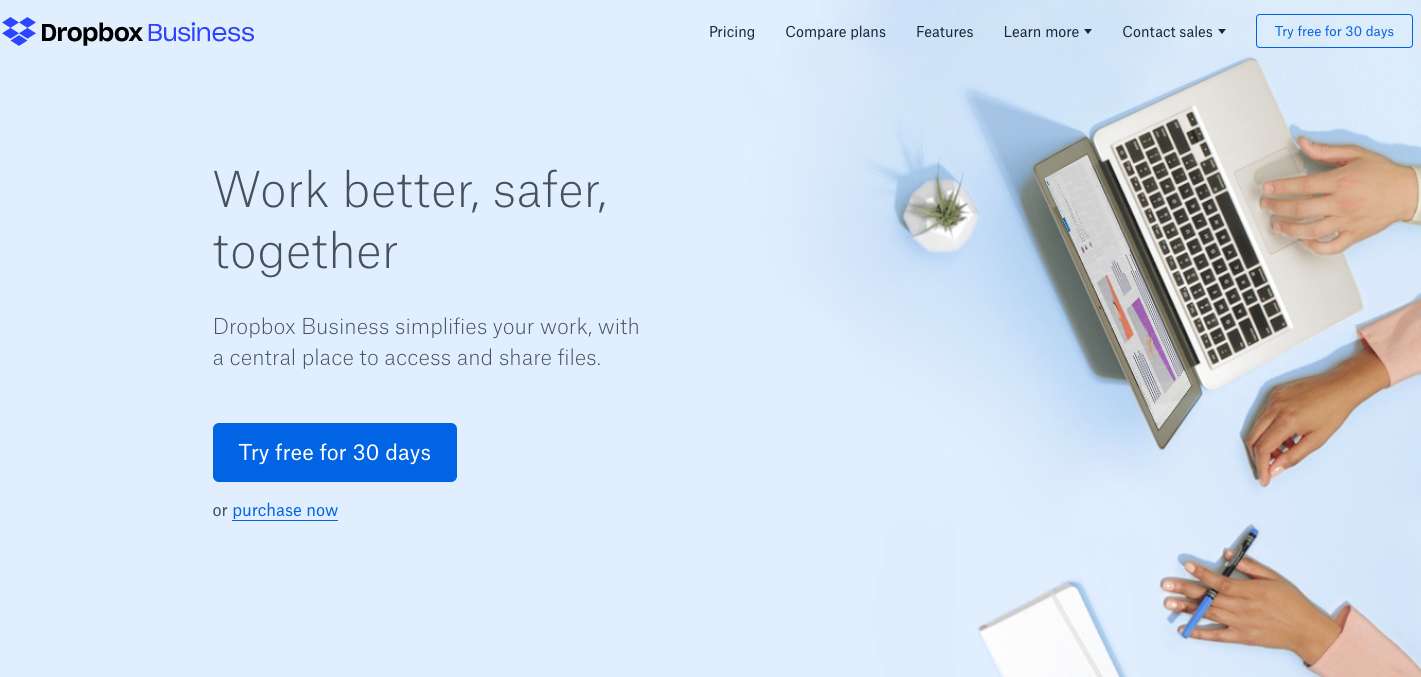
Dropbox Business can be a typical example that adopts the Material Design concept since early times, and the branded blue is very perfectfor material. The website uses one single color palette with black and white included as background.
3. Waaark.com
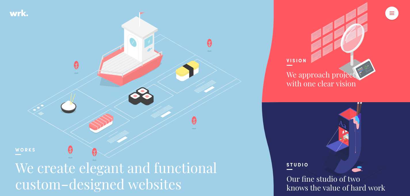
In response to the guidelines of animation effects, Waaark has showed us a good balance with elements and layout. The animation on the homepage can be switched intelligently with the mouse drag, which looks like wave flows on the screen. But this also obeys the movement rules in reality and all changes are accelerated/decelerated gradually.
4. Serioverify.com
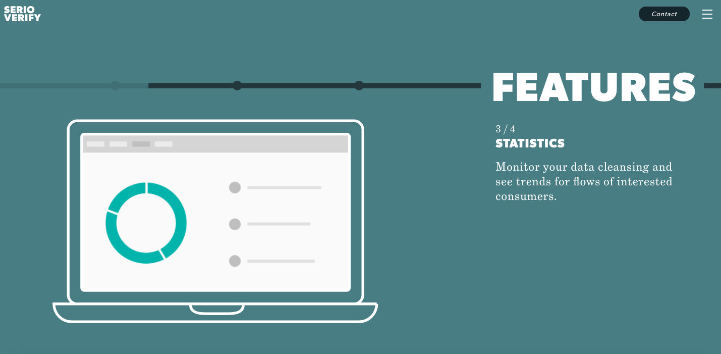
Following by the perpendicular guidelines of Google design, Serioverify has applied the default altitude which gives a sense of consistency for upcoming visitors. Also, developers can control the element's altitude and projection by one single value.
5. Pumperl Gsund
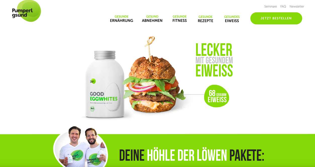
In contrast to Dropbox Business, Pumperl Gsund has used light colors mainly, with some less-noticeable colors in the background, and the remaining is set to black and white. This is not to the guidelines, but doesn't affect the overall appearance and ease of use of this website.
6. Behance
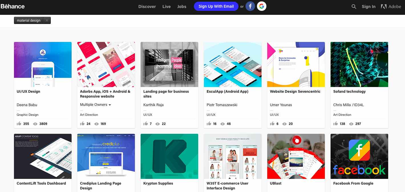
As a great example for getting design inspiration, Behance has a rich set of examples for you to refer to. It makes use of material design well on its own in many places, like spaces, buttons, and text layouts to make people feel pleasant.
7. Codepen
Website:
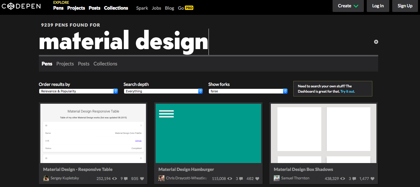
As its name implies, Codepen is a website loved by front-end developers and engineers. It's a playground for the front-end side of the web and a great place to see really cool examples of material design. Plus, it's possible to see the underlying CSS, HTML, as well as JavaScript which are used to build that animation or design.
8. Mockplus
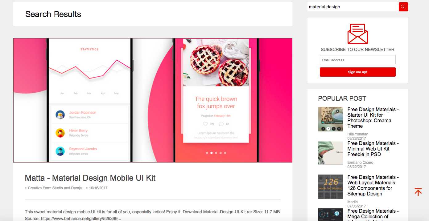
As an all-inclusive prototyping tool, Mockplus also contributes to providing a countless board of good-looking and useful free design materials, from material design, flat design, to interactive design and card design. All those materials are available for free download and use. The ready-made components and icons library will get your design started and well completed in a faster and easier way. All platforms are supported, including Windows, macOS, Android, and iOS.
9. Dribbble
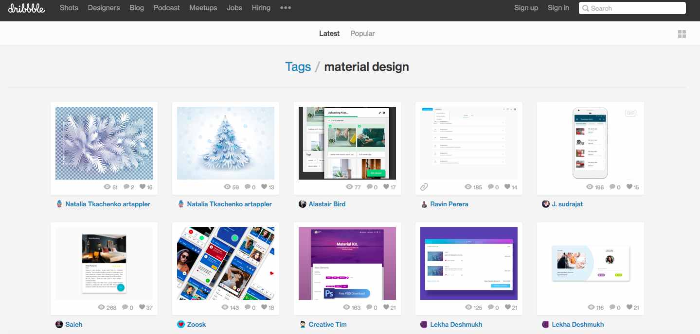
Dribbble is a social network for designers, developers and artists as well as other creative individuals. It's easy to find bountiful material design resources for both web and app design. Also, you can get inspirations from something as simple as an icon to a full-functional website design.
10. MaterialUp
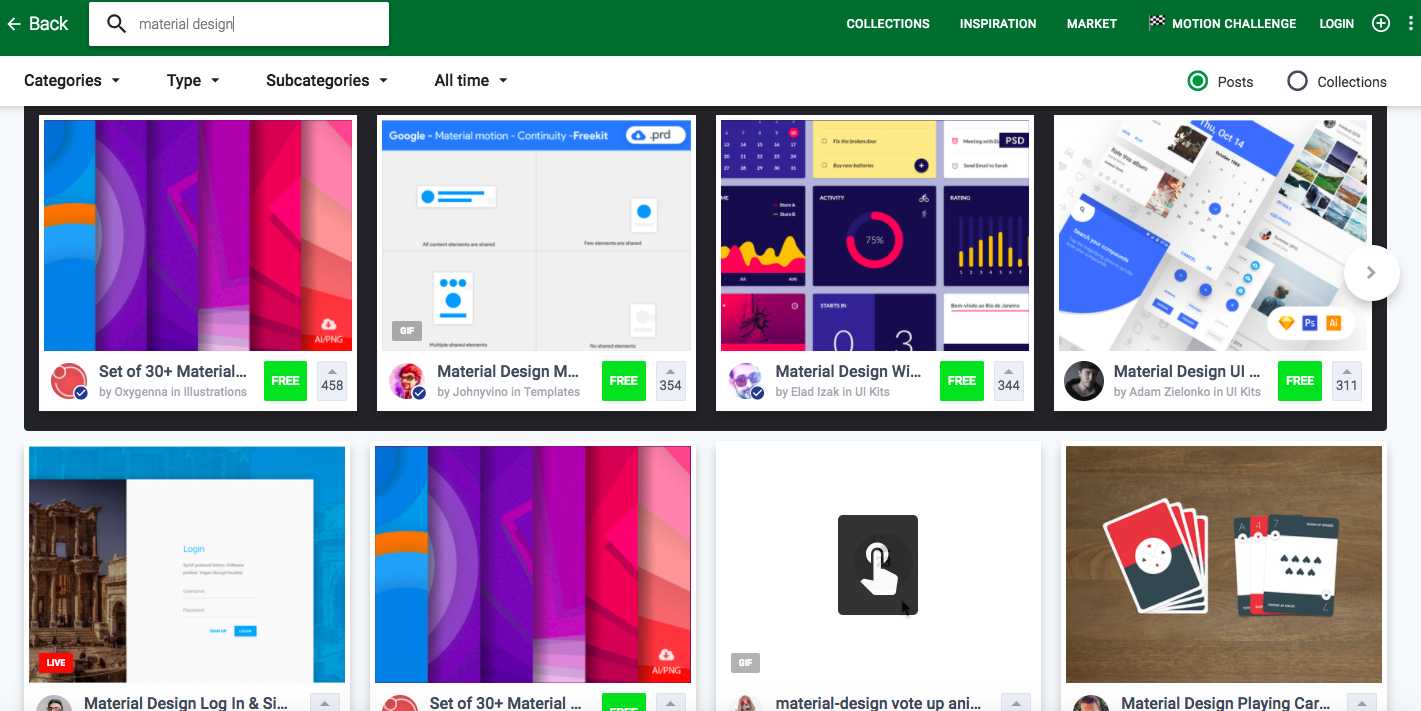
Material Up focuses solely on the material design topic, providing web examples, mobile app screenshots, tips, tools and many other things. The layout and look of MaterialUp just are reminiscent of Google Drive,and it's worth your trust to find something of use.
11. Reddit
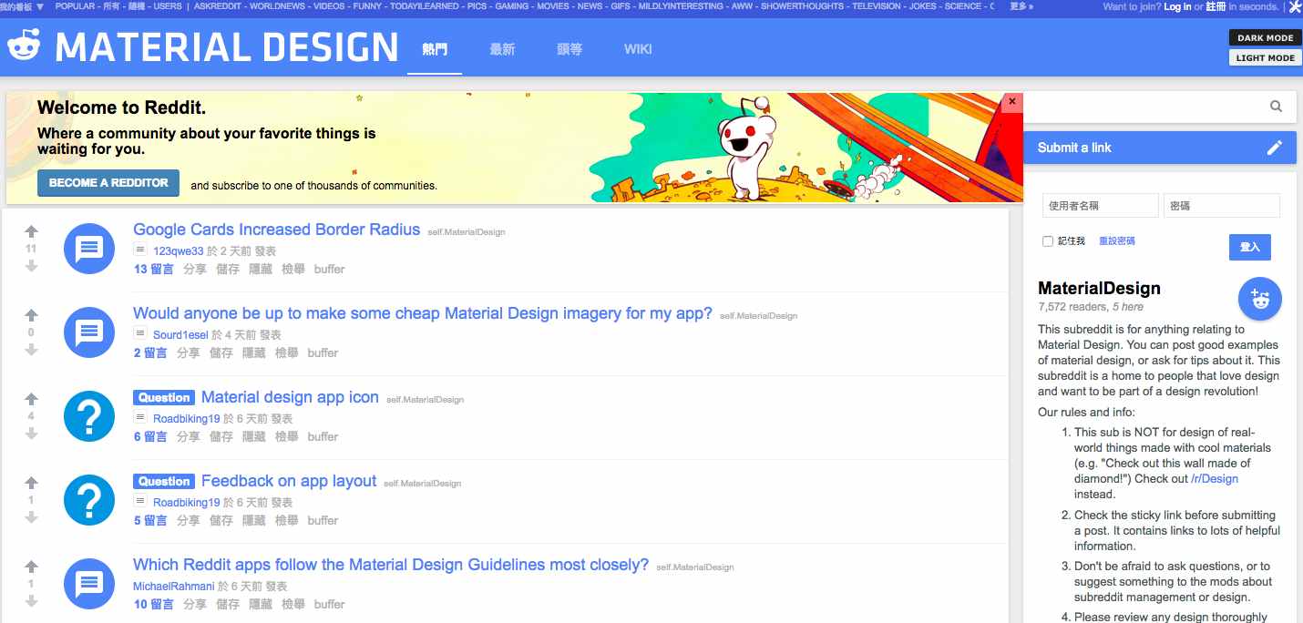
Reddit may not be the best place to look for design inspirations, and there is a sole sub for Material Design. Half of the posts are design revamps, and the other half are the original design submissions that need feedback. If you want to review and discuss design related topics with like-minded individuals, this is a go-to option.
12. Tumblr
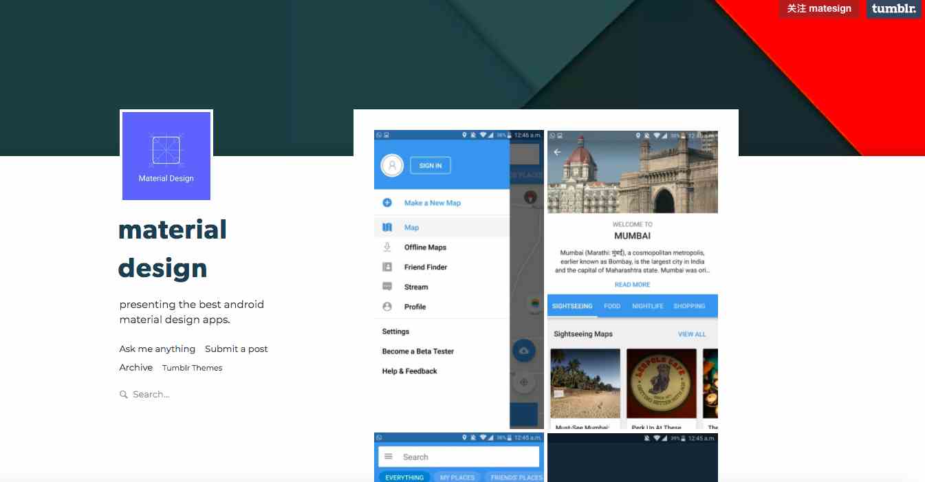
Whether you design Android/iOS Apps, websites or something else, if you want to learn more about how to better execute material design, Tumblr is a good resource to check out. Scroll down its feed and you will discover examples of different types to get inspirations for the next project.
In Conclusion
Above are the highly-recommended Material Design website examples. It's noticeable that since the first inception of Material Design in 2014, the end users were always at the forefront of their missions. If you're ready to get started, you can take some time reading Google's guidelines and specifications, which will give you a solid base to work from. Also, an excellent tool can help to turn your ideas into reality, and Mockplus is recommended here for its simple-yet-powerful features with a large library of design materials for your free use.
Web App With Material Design
Source: https://www.mockplus.com/blog/post/material-design-website-examples
Posted by: voexill1984.blogspot.com

0 Response to "Web App With Material Design"
Post a Comment